
Helping AirBolt with our comprehensive, end-to-end design services
AirBolt is an Australian tech company that creates state-of-the-art trackers and locks to make losing things a thing of the past.

AirBolt is an Australian tech company that creates state-of-the-art trackers and locks to make losing things a thing of the past.
Their vision is to become the market leader in remote access management and asset tracking, so they reached out to us to help them achieve this goal.
It was an interesting challenge to help the company, as AirBolt was launched in 2014 and already had two super successful Kickstarter campaigns behind its back.

As the tech firm already had an established presence on the market they wanted to keep the brand feeling familiar but also improve it to be more modern and up-to-date.
Their initial goal was to improve their website’s conversion rate and to clearly and efficiently communicate the range of AirBolt’s products and their capabilities.
We started off with a simple website redesign, however, as the work went on the scope was continuously extended with several design services, such as UX audit, brand facelift, mobile app redesign, product and lifestyle photoshoot and packaging design.
During the initial phase, we provided AirBolt with a smaller scale UX Audit, where we analysed all the subpages of the website.
We did not have to dig deep to identify a large amount of “quick wins”: we could easily modify several smaller elements to instantly improve the website’s performance. These “quick wins” were, just to mention a few:

We found bad contrast ratios, inconsistent colours and font sizes which could quickly be fixed.

The landing hero carousel did not convert adequately.

The website’s structure was neither transparent nor easy-to-understand, so we provided AirBolt with a good overall structure to guide users through the page.
We also decided to conduct the UX audit and the brand facelift at the same time which saved a tremendous amount of time and money for our client: one of AirBolt’s developer colleagues started to work on the website based on our designs, we reviewed their work continuously, and when something didn’t turn out as planned we indicated immediately and helped them fix the incorrectly implemented element.
The AirBolt logo was a fixed point as they have already built a strong brand identity around it. We analysed it thoroughly and identified some important issues:
In general, the logo remained the same nevertheless, we greatly improved its quality and thus its usability too!

When zooming in, one could find numerous breakpoints and faulty lines as it had poor overall quality.

Thin lines were not visible on the website and on the products either - we corrected this by improving the contrast.
Simple but simply better.
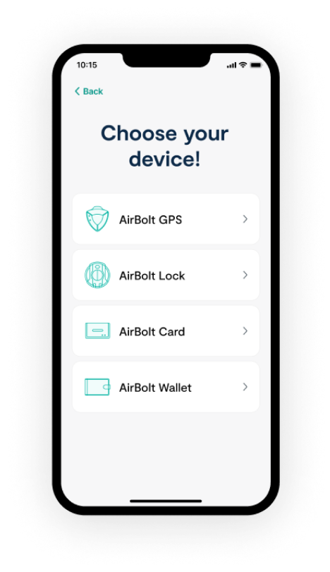
Regarding the mobile app redesign, the main concept was to keep everything clean and simple but to also make the interface attractive for users. Although we liked the simple experience the app offered, we definitely needed to give it a fresh look and align it with the newly created website design.


We approached the redesign of the website based on the previously conducted UX audit and the rebranding phase.
Throughout the audit, it turned out without doubt that creating the appropriate structure is essential as the company continuously launches new products. We laid special emphasis on the webshop subpage applying a strong UX focus, so users can order products more seamlessly which further enhances sales.
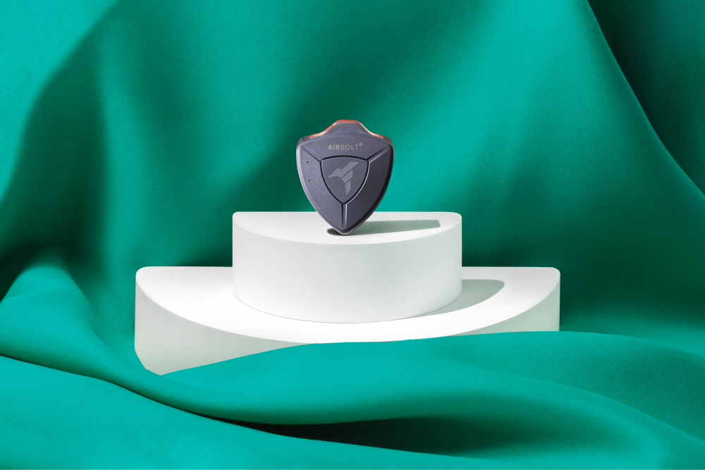
The lifestyle image Airbolt provides is also key to engage customers, therefore we decided to use pastel colours and as their special products cannot be illustrated with stock photos, we also considered it important to conduct a lifestyle photoshoot ourselves. This way the pictures are not only specific to Airbolt but also show a unified image.
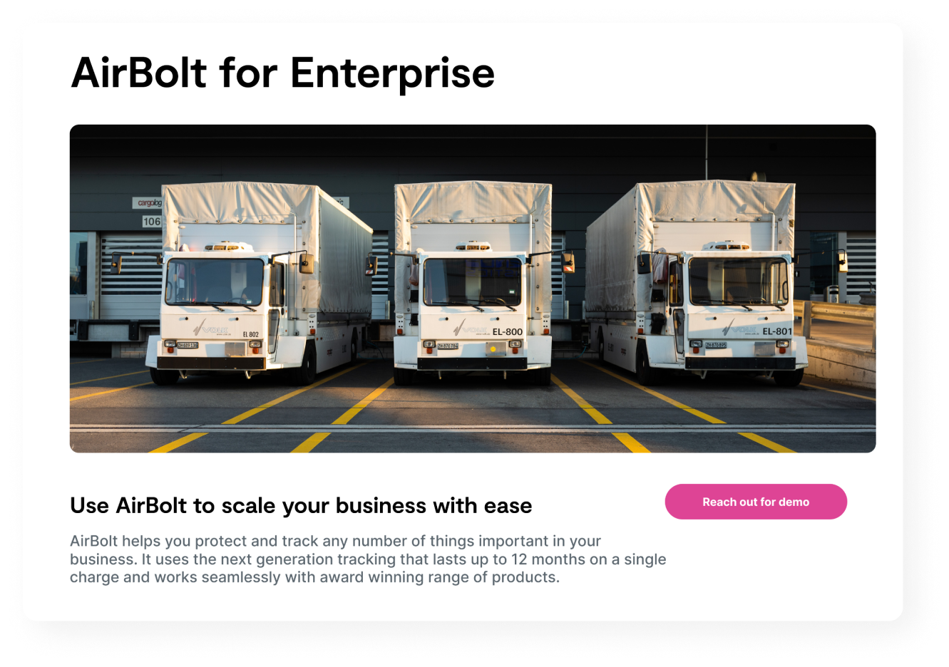
We also designed custom icons and illustrations for the company. As we couldn’t use photos on their enterprise subpage, we decided to go with specific illustrations designed in a distinct style.
As the “gadget” market is quite saturated, we decided to give the brand a unique edge: although they design, create and sell tech equipment, we highlighted the lifestyle improvement that their products guarantee.
Before each photoshoot, we created a moodboard and we also discussed the specific needs of the client in detail. During the lifestyle photoshoot phase we provided Airbolt with a strong art direction and also gave them suggestions on what to show and how to show it. The images were created, retouched and saved in different sizes, while we also optimised them for social media and marketing purposes.
We paired certain colours with lifestyle categories and linked the photoshoot strongly to the branding. In case of the product photos, we desired to achieve a professional, yet lively look-and-feel, since AirBolt wants to distinguish itself as a lifestyle company, rather than a tech firm. Through the use of colour-blocking and a mix of different items corresponding to the products’ lifestyle category, as well as other materials and textures, we could achieve this goal while still emphasising the products themselves.
The principles we followed throughout creating the lifestyle images were the following:
items to emphasise product
shadows


As for the product photoshoot, there were many different products and accessories which also needed to be displayed on several different platforms.
Furthermore, every single product needed to be shot various times and from distinct angles for the webshop gallery. For instance, one of the compositions needed to be the product held in hand in order to demonstrate its size.
Another framing was the reinforcement of the lifestyle message: i.e. we attached the trackers and locks to a backpack or a bike. This approach was quite a challenge as it wasn’t always easy to find the perfect composition and angle in case of certain products.
Another challenging task was taking professional yet attractive photos of cables and other accessories.
As it was essential from a branding point of view to have a unified image throughout the design of the packaging of their products too, Airbolt asked us to create separate packaging designs for their GPS device, locks and wallets as well.
In case of the wallet, it was also key to create an instruction manual on how to use it, and additional designs for the packaging of the supplementary collar connected to their GPS device were also needed.
By the end of this phase, we completely redesigned the packaging of the whole product family and made their style consistent with the newly released branding, as well as added the new icons which were aligned with the style of the website.

It was an amazing experience to work together with an Australian tech startup and a wonderful opportunity to further strengthen our presence in the ASEAN region.
Throughout our joint work with the company, we can say that countless iterations were made, but to our great pleasure, in the end everyone was happy with the results.
During this project we used the whole palette of design softwares from PhotoShop, through Figma and Illustrator to Lightroom and Indesign.
A huge team with plenty of tools was working on this project for more than half a year, which turned out to be a great success!


